Look a little closer
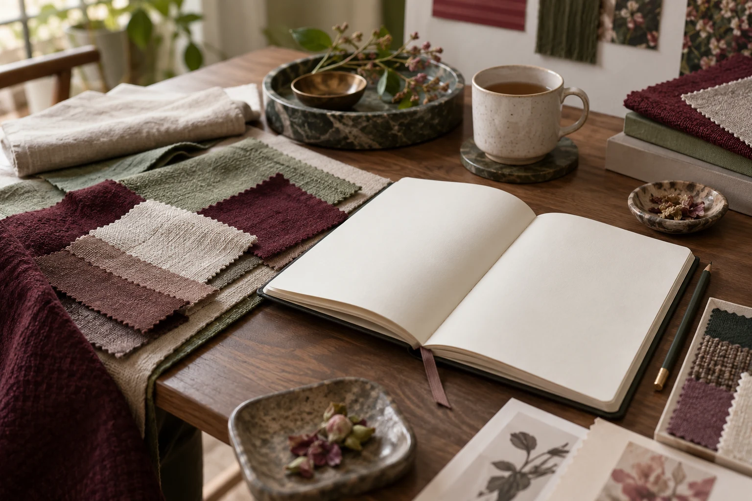
A compact palette can begin with a dominant colour, a quieter background and a small accent. These roles are an optional design exercise rather than a rule about which colours people should wear. The same berry colour can appear bold on cream and quieter beside another dark tone.
A note for your design book
Arrange a few paper or fabric samples in the proportions you expect to use. Note which colour draws attention and whether the background changes that impression. Record the actual samples rather than relying only on a screen image. Keep any historical reference linked and contextualised; a personal palette does not establish the meaning of a colour in another culture.